Part 1: Setting up the Layout
Overview
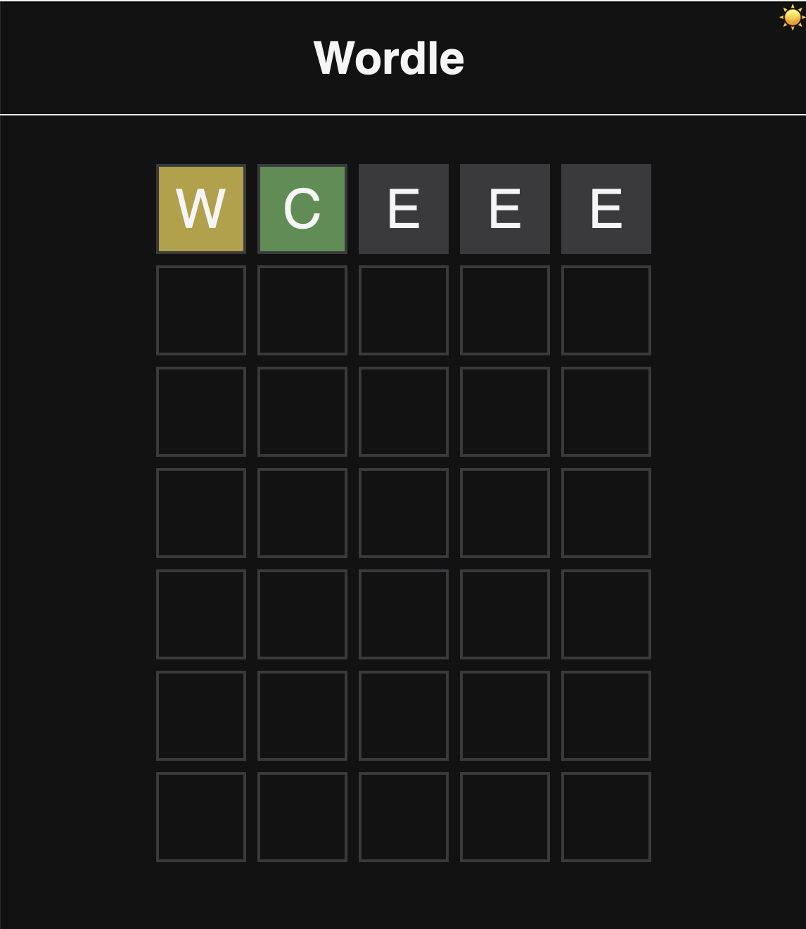
In this step, we will work on setting up the application layout (Just the look and feel). By the end of this step, we will have a page that looks like this

Our goal is to have:
- a page that contains a header with the title of the game and a grid that represents the game board.
- The grid consists of 6 rows and 5 columns.
- Each cell in the grid will represent a letter in the word that the user is trying to guess.
- We will also add some styles to some of the cells to resemble the game's behavior when a user makes a guess, and we'll do that using CSS classes.
Initial Structure
We'll start with the index.html file.
- Update the title of the page to
Wordle. - Inside the
body, create aheaderelement with:- an
h1tag andWordleas the content.
- an
- include the
assets/styles/style.cssfile in theheadtag of the page. - in the bottom of the body element, include the:
assets/scripts/dark-mode-toggle.jsfile.assets/scripts/game.jsfile.assets/scripts/main.jsfile.
Styling the Layout
CSS Reset
Sometime, browsers may add some default styles to the page. To get full control over your page styles, we can use a CSS reset. There are two ways to reset the default styles:
- We can either use a css library file like
normalize.cssto reset the default styles.
- Add the following link to the
headtag of the page (before our own styles are included)
<link rel="stylesheet" href="https://cdnjs.cloudflare.com/ajax/libs/normalize/8.0.1/normalize.min.css">
- Or we can create our own reset styles. I'm going with this option not to over-complicate things.
- In the
styles.cssfile:- set the
bodymargin and padding to 0.
- set the
- In the
Now actually styling things
body- Set the font-family of your liking.
- Set the background color of the body to a dark color (I'm using
#0B1623). - Set the color of the text to a light color (I'm using
#F5F8FF).
header- Set the bottom border of the
headertag to a light color (I'm using#F5F8FF). - Center the
h1tag in theheadertag.
- Set the bottom border of the
🦉: UI/UX best practices recommend that you don't use pure black in your background; Pure black could cause eye strain to users. That's why I'm using different dark/light color pair, feel free to use any other combination
Game Grid Layout
- Create a
divwith an id ofgameto hold the game's elements. - Inside the
gamediv, create adivwith an id ofwordle-gridto hold the game's grid.- FYI - The grid consists of 6 rows (or the number of allowed attempts) and 5 columns (or the number of letters in the word).
- Create the grid for a single attempt (a row with 5 columns).
- Inside the
griddiv, create 5divtags with a class ofletter.
- Inside the
Styling the Grid
Letter Boxes
- create a style definition for the
letterclass in thestyles.cssfile. - Modify the
letterclass styles in thestyles.cssfile as follows:- Set the width and height of the
letterclass to60px. - Create a border for the letter class the borders of the
letterclass to2px solid <light color>(I'm using#3A3A3C). - Enforce a
text-transformationof the letters so they are upper-cased. - We can set the
font-sizefor the letters2.4rem.- Click here to learn about rem.
- Center the text in the middle of the
div
- Set the width and height of the
💰 this is my go-to snippet for centering something horizontally and vertically in html...
  .letter {
    ...
    display: grid;
    place-items: center;
    ...
  }
- Learn more about CSS Grid here
Game Grid
- To Make the grid look like a grid, we can set the
displayproperty of thewordle-griddiv togrid.- We also need to set the tracks of the grid to 5 columns.
- We can set the gap between the columns to 8px. to spread out the letter boxes a bit
- Learn more about CSS Grid here
💰 check out this snippet
#wordle-grid {
  display: grid;
  grid-template-columns: repeat(5, auto);
  gap: 8px;
}
-
Because we're set the columns to repeat 5 times, if you go back to the HTML and add 5 more
divtags with a class ofletter, you should see the grid expand to 2 rows. -
The
div.gameby default, expands to the height of thediv.wordle-grid. We can set the height of thediv.gameto a fixed value (I'm using 70vh).- We can also center the
div.wordle-gridin thediv.gameusing thedisplay: gridandplace-items: centerproperties. - Now, the grid isn't touching the header element
- We can also center the
Back to the letter squares
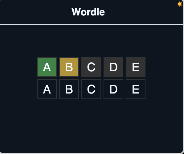
As you know in the game, when a user makes a guess, the game should show the user the result of the guess.
- It colors the square green-ish if the letter is in the word and in the correct position.
- It colors the square yellow-ish if the letter is in the word but in the wrong position.
- It colors the square gray-ish if the letter is not in the word.
Let's create 3 classes for each of the states:
correctfor the green-ish color.misplacedfor the yellow-ish color.incorrectfor the gray-ish color.
to use the exact colors as Wordle, we can use the following colors:
#538D4Efor the correct class.#B59F3Bfor the misplaced class.#3A3A3Cfor the incorrect class.
Assign those classes to some of the letter divs
Now the page should look like this
